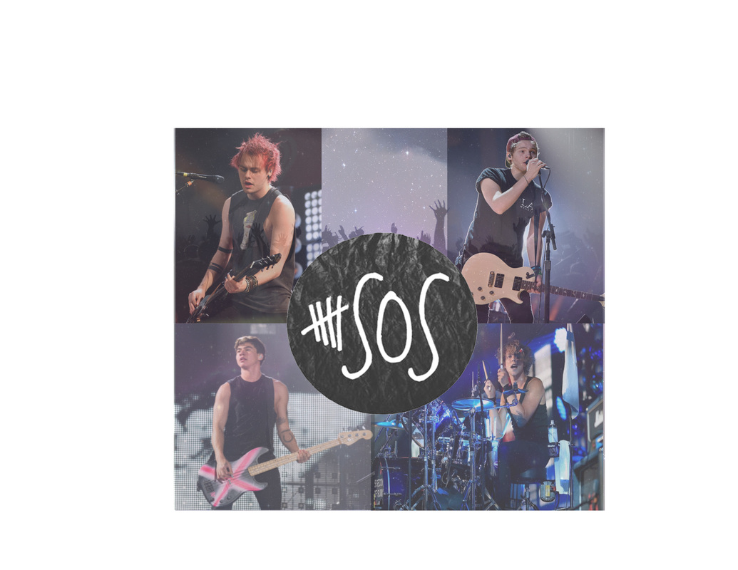
I used my brainstorm in my design by using the pictures of the band and putting them into a collage. A struggle I had to overcome was trying to decide what opacity level I should place each picture on. My design did end up looking how I wanted it to. I would buy this product because I think it is unique and has really cool different levels like the galaxy to the hands in the air. The most successful part would probably be the pictures behind the band members. I could probably have changed the edges and made them rounder.
Comments:
Lucy- Looks great but could be a little rounded on the edges which i think would make it look a bit better. I like the opacity level which is just right for this picture. I like the collage effect and how she filled in the space in the middle with the hands as well as added the galaxy background to that particular photo.
Abbie - Looks really good I also wish that the edges were rounded. I really like how the pictures collage together and the opacity of the their logo in the middle.

I like this because I like the singer and the lyrics. Also the picture is really creative.

This shirt is nice because I like this band and the floral print is pretty.

This shirt is cool because I like the statement and new york is really pretty.

it's funny and I like the band

I like this band and it's really simple
- dark like black, grey and white.
- smaller words and pictures
- keep it simple and not too busy
- bold letters
- white background
- smaller words and pictures
- keep it simple and not too busy
- bold letters
- white background
